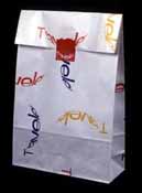
| The corporate identity system visualizes the company ideology, "The world is our stage. We contribute to the new affluence people are asking for by developing and offering things of value."
The mind's eye completes the globe suggested by the curved letterforms in the logotype. The symmetrically balanced upper case T represents the stability of an established, 500 employee corporation and acts as a firm anchor from which dynamic world travel embarks. The application of color is used to distinguish between the corporation
and the retailer and multicorporate colors give each encounter with
Traveler a sense of freshness. |
 |
 |
|
 |
|